Forms
Introduction
LIMBAS Forms display tables graphically and enable you, to enter the table fields or change them. In LIMBAS, there are standard forms (default forms) and custom forms. Both types have certain advantages and disadvantages depending on the intended use.
Default Forms
For each table a default form is dynamically generated by LIMBAS. It is possible to work with the contents of the table without creating a custom form. A great advantage of the default form is that a newly created table field is immediately available for use on the form.
The default form displays all fields listed consecutively from top to bottom. Fields can be sorted and grouped. Groupings are displayed by tabs or headings. In addition, it is possible to put fields side by side or in subgroups. All these settings are already made in the table definition, where the fields are created. Further formatting is only possible within the LIMBAS layout.
Custom Forms
The LIMBAS form editor is used to create custom forms. This allows you in an easy way to create your own individual forms. Unlimited forms for a table can be created. Changes in the definition of the table must be applied manually also in the forms. This means that new fields are not automatically applied in the forms, they must be added according to your individually needs. Forms also can use for calendar tables oder filesystem. For filesystem you have to create the form for table “ldms_form”.
List Forms
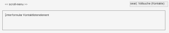
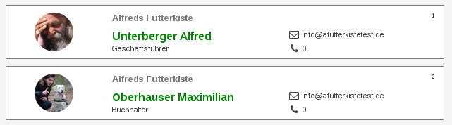
List forms are for displaying and editing multiple records and provide an alternative to list view. They consist of the list form, the outer form (Fig. 1) and the individual list elements, the inner form (Fig. 2).
In the inner form (e.g., contact list element), the single contact is displayed. To create an outer form, an inner form is required (see Fig. 1). Also see Link List Forms
Form Editor
Admin->Forms displays all existing forms, sorted by tables, with the possibility to add more forms.
- ID: Unique identification for the form, generated by LIMBAS.
- Edit: Click on the ‘Edit’ icon (only if the form is not implemented as an extension).
- Delete: Click on the ‘Trash’ icon, the appropriate form will be deleted after confirmation.
- Form Name: The name of the form.
- Created by: Name of the user who created the form.
- Table: Specifies the table which can be edited using the form.
- Extension: Name of the file in which the form is implemented (only if the form is created as a PHP file).
Add Form
- Form name: The name of the form.
- Table: Specifies the table which can be edited using the form.
- Copy: Name of the existing form, from which form elements are copied into the new form.
- Type:
- Design with unique record (=Record View)
- Design with Record List (not part of the existing admin documentation!)
This description refers for the moment only to the ‘Design with unique record’ setting. For the ‘Design with Record List’ setting there are differences in the toolbar of the form editor, as well as for the form element types.
- Extension: Name of a PHP file ./dependent/EXTENSIONS/*.ext, in which the new form is implemented.
Click on the ‘New Form’ button and the new form will be displayed in the list of forms and can be edited
Edit Form
On the left side of the form editor the current form is displayed. A newly created form is still empty.
The toolbar is located on the right side of the form editor and is divided into:
- Name of the form ,the table that is being modified with the form and the type of the form
- Coordinates, width, and height of the selected form element
- Global Form settings:
- Class: If a CSS style sheet file (from the path ./dependent/EXTENSIONS/css) is selected, it will be integrated in the form and can be used for the formatting of the form elements (see Class).
- Font: Default setting for font and font size used for new form elements that contain text.
- Grid:
- Maintain Proportions: If enabled, height and width of the selected form element can be modified; the aspect ratio will stay the same. If disabled, height and width of the selected form element can be modified independently of each other.
- Consider Z index: see zIndex
- Renew Z index: see zIndex
- Buttons to add ‘Form Elements’. Hover the mouse pointer over the buttons, to see their functionality.
- ‘Save’ button to save the form.
- Table with collection of the ‘Form Elements’ used. The table shows for each ‘Form Element’ that is used in the form:
- the value of the zIndex (see zIndex)
- the type of the ‘Form Element’
- an indication of the content of the ‘Form Element’
Add a ‘Form Element‘
Click on a button to add a ‘Form Element’ and a corresponding element is added in the top left corner of the ‘Form Editor’, with the default properties for this element type. The properties of a ‘Form Element’ depend on the element type and can be changed as described in ((Setting/changing the properties of a Form Element)).
To create ‘Form Element’ inside another element (E.g. a text input field inside a tab), the outer ‘Form Element’ must be created first. The outer ‘Form Element’ must be selected before you add the inner ‘Form Element’. The inner ‘Form Element’ is then placed in the upper left corner of the outer ‘Form Element’. The following elements are offered by the LIMBAS form editor for placement on a custom form:
Text Block
Free text
Data Content
Click on the button for ‘Contents’ and a tree of the fields of the table is displayed in the tool bar below the buttons. With a click on one of these table fields the ‘Form Element’ in the form view is added. Linked tables can be opened and their fields can also be selected. Please note, this only makes sense, if the linked fields contain only 1 data record.A list of data records for several linked data records can be added using the ‘Link Field’ itself. The table is then displayed, in the specified frame, which is also used for links in the default form. For features for table links see. -> Links
In addition, filter and display parameters can be adjusted via the Menu Item ‘Parameter’ in the Context Menu, using the global ‘$filter’ array. Depending on the parameters, standard functionalities of the ‘Link Table’ are hidden or the content is filtered. These settings apply only to the ‘Form Element’ and not globally for all ‘Link Tables’.
The width of the fields is equal by default and adapts to the width of the table. Using the parameter ‘width’, the width of the fields in the Record List of the table can be applied, or the width can be defined for each field individually.
Special Feature:
There are 4 different scrolling behaviors when the contents of the table are too large, which can be selected via the context menu item ‘Form’:
- Auto – The specified size is retained, overflows are provided with Scrollbalkenlmb_gtabDetailIFrame . The table head stops scrolling. Scollable transitions are not possible. The width of the columns adjusts to the maximum width of the element. The filter parameter ‘width’ is not interpreted.
- Scrollbar – The specified size is retained, overflows are provided with scrollbars. The tabhead scrolls with scrolling. Can be scrolled to the right.
- Visible – The size is enlarged to the maximum size without the scroll bar. Other form elements can be superimposed.
- Cut Off – The size is cut to the specified size.The following element types are offered by the LIMBAS form:
Text Block
Filter parameters:
- gsr: Filter result list
- no_add: Do not create a new data record
- no_new: Do not create a new data record with list functions (only available in edit mode)
- no_edit: Do not edit data records
- no_replace: Do not replace data records
- no_search: Do not browse data records
- no_copy: Do not copy data records
- no_link: No quick link
- no_openlist: Do not open the Record List
- no_fieldselect: No field selection
- no_delete: Do not delete data records
- no_sort: No sort of data records
- no_menu: No Menu Bar
- showall: Show all records found
- getlongval: Show contents of ‘Long’ columns
- nogresult: Use existing ‘gresult’ if present (only applies to sub forms)
- edit: Editing of defined columns
- order: Sort of score (or result list)
- showfields: Show fields
- width: Adjust field width
- no_calendar: Do not show calendar options (only in calendar table)
- show_relationpath: Open new link in the same window
- show_inframe: Open details in the same window, otherwise new browser window
- div : in new div
- innerframe : in new iframe
- [tag-name] : in existing div or iframe
- [empty] : in new window
- formid: open details in specific form
- viewmode: overwrites the display of field types. Possible values are single_ajax, multi_ajax, dropdown, defauld
- count: Number of records to display. Number or ‘all’ for all records
- pagination: activates the scrolling of the results. By default, this is disabled and all results are displayed.
Example:
$gsr[4][22][0] = $ID;

 return array(
 'no_add' => 1,
 'no_new' => 1,
 'no_edit' => 1,
 'no_search' => 1,
 'no_replace' => 1,
 'no_copy' => 1,
 'no_link' => 1,
 'no_openlist' => 1,
 'no_fieldselect' => 1,
 'no_delete' => 1,
 'no_sort' => 1,
 'no_menu' => 1,
 'showall' => 1,
 'getlongval' => 1,
 'nogresult' => 0,
 'edit' => array(16,19,23),
 'order' => array(array(4,2,'DESC'),array(4,3,'DESC')),
 'showfields' => array(1,2,3,4,5),
 'width' => array(1=>10,2=>10,3=>50,4=>50,5=>30),
 'show_relationpath' => 1,
 'show_inframe' => 'my-div-ID',
 'formid' => 12,
 'no_calendar' => 1,
 'viewmode' => 'dropdown',
 'count' => 15,
 'pagination' => 1
 );
Note: If more or fewer fields are visible than desired, it is because individual settings are available. These can be reset in the “View” menu of the actual table via “Reset view”.
Sub Form
Click on the button for ‘Sub form’, a form selection (style and type) appears in the tool bar below the buttons. Select the style and type required and click on ‘Apply’ to add the sub form to the form view. Style
Select a form type to control the behavior of the form:
- User defined
For IFRAME style the URL, which is entered in the parameter of the Context Menu is opened. The URL parameter can contain PHP code and will be executed. For the content of the DIV the content of the parameter of the context menu is used. The URL parameter can contain PHP code and will be executed.
- Sub form
IFRAME style, opens the selected sub form as a URL in an IFRAME. The content entered in the URL parameter of the context menus is appended to the URL. For DIV style as CONTENT the selected sub form entered in a DIV. Before generating the sub form, the URL parameters are, executed compliant to the function get_gresult().
- Table
IFRAME style will open the selected table as an URL in an IFRAME. The display is compliant to the Record List. The content entered in the URL parameter of the Context Menu is appended to the URL. DIV style, the CONTENTS of the selected table is opened in a DIV. The display is compliant to Link Tables. Before generating the sub form, the URL parameters are executed, compliant to ‘Linked Tables’.
Style
Special Feature:
In general, the frame of the sub form is displayed, according to the chosen ‘Style’ and ‘Size’ settings. For a sub form of the type ‘Sub form’ displayed as ‘DIV’, the style (except for positioning) is only taken, if a value has been assigned to the parameter ‘Form’ (auto/visible/cut/scrollbar). If no value is set, the sub form is displayed in full size (i.e. 100% width) in the main form.
Info:
Additionally filter- and displayparameters could be added in the “parameters” menu as it is done with the link tables.
Example to filter a DIV element: (get_gresult())
$gsr[47][11]['txt'][0] = 2; # ganzes Wort suchen
$gsr[47][11][0] = $gresult[4][2][0]; # Filter nach Inhalt
Example to filter a subform or a table IFRAME element IFRAME Elements: (URL_Syntax)
return "rgsr[179][12][0]=".$gresult[$gtabid][26][0]."&rgsr[179][12][txt][0]=2";Example to filter a custom IFRAME element: (URL_Syntax)
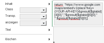
Show a customer location on a map. return “https://www.google.com/maps/embed/v1/place?key={YOUR_API_KEY}&q=“.$gresult[$gtabid][4][0].”,”.$gresult[$gtabid][6][0].” “.$gresult[$gtabid][5][0];
// get street // get zip // get cityor
return "main.php?action=gtab_erg>abid=1&rgsr[1][2][0]=AlfredsFutterkiste&rgsr[1][2][1]=
Nudelkisten&rgsr[1][2][andor][1]=2&filter[anzahl][4]=10&filter[page][4]=1";Hierbei wird die Spalte Vorname der Tabelle Kontakte nach “AlfredsFutterkiste” und “Nudelkisten” durchsucht. Nur Datensätze, die einer der beiden Kriterien entsprechen werden angezeigt.
Zudem ist angegeben, dass ohne Offset ausgelesen werden soll und max. 10 Ergebnisse angezeigt werden sollen.
Link List Forms
To link an inner form with an outer form, create a new subform with the style div, the type subform and specify the inner form as the subform:
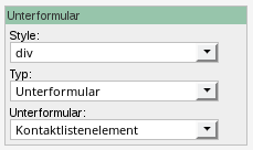
Also see: List Forms
Display
Unlike other ‘Form Elements’, ‘Link Tables’ cannot directly be formatted using the Form Editor, as they are part of the default form and are tied to the global layout. The ‘Link Table’ also consists of many elements such as table header, table content and menus. There is a possibility to overwrite the existing styles via a customized CSS style sheet file that can be assigned to the form.
Example:
 .gtabFringeRelationBody{
 	border: 0;
 	background-color: transparent !important;
 }

 .gtabHeaderRelationTAB{
 	padding-bottom: 5px;
 	border: 0;
 }

 .gtabBodyTR{
 }

 .gtabBodyTD{
 	padding: 3px 0;
 }

 .lmbfringeGtabBody{
 	border-radius: 4px;
 }

 .gtabHeaderTitleTD{
 	font-size: 110%;
 }
As an alternative to the ‘Link table’, a sub form with special filter can be created. Links must then be handled by appropriate extensions.
Data Label
Mouse click on the button for ‘Data label’, a tree of the fields of the table appears in the tool bar below the buttons. With a click one of these table fields the ‘Form element’ is added to the form view.
Graphics
Click on the button for ‘Graphics’, a field for entering a file path appears in the tool bar below the buttons. If a valid graphics file is entered, it is added in the form view with a click on ‘Apply’.
Table
With this element an html table can be added. Columns and rows can be defined. Elements can be inserted by a click on the cell, and then a click in the element of the table. Rows are inserted or deleted always below the currently selected row. It is possible to nest tables, as well as to use border elements and grouping elements in cells. If, in the context menu of the table the menu item ‘Type’ is not selected, the height of the table is based on its content. If instead ‘auto/visible/cut’ is selected, the defined height of the table is taken into account and displayed depending on the selected ‘Type’ (equivalent to CSS style overflow).
Date
datepicker field
Rectangle
Rectangle for layout design
Main Menu Grouped
Elements can be grouped using this frame. Tabs are automatically created for divisions.
Tabulator Border
Using this frame, elements can also be grouped. Tabs can be defined individually. Tabs can be positioned left or top.
Grouping Frame
Easy grouping frame without tabs. This is used for quick grouping of elements.
Submit-Button
Submits the form
Scroll Bar to scroll the data records
Footer for scrolling
Text input field
Custom form element.
Text area input field
Custom form element.
Select Input
Custom form element.
Custom form element.
Checkbox Element
custom form element.
Radio-Element
custom form element.
Hidden-Input
custom form element.
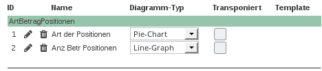
Diagram
Shows an already created Diagram.
Reminder
Creates a button to quickly create a resubmission form on the form. As parameters, certain presets can be specified in the form of an array:
$config = array(
    'datetime' => '10.03.2017 22:55', /* datetime string */
    'usergroups' => '1_u', /* e.g. '33_u;22_g;55_u' or  for current user */
    'remark' => 'testtttt', /* string */
    'mail' => 0, /* 0 or 1 */
    'category' => 2, /* id of category */
    'hidecurrent' => 1
);
Workflow-History
Shows a history of events in the Workflow.
Html-Templates
Described at Html-Templates.
Java-Script
Free javascript for your own extensions.
PHP-Script
Free PHP for own extensions. Include () or function calls.
return ‘hello world’;
Example: Embedding a chart (outdated)
Using a PHP-script, you can embed a chart (which was created using the LIMBAS chart editor) into a form. In the following example, we want to embed a pie-chart in a form of the table orders, which should show the type (hardware/software/hosting/service) and the amount of each type of positions linked to the selected order.
To embed the chart, 3 elements must be created:
- A query
- A chart based on the query
- A PHP-script, which shows the chart
First, we have to create the query:
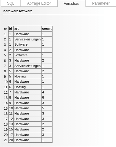
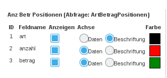
The query shows the sum of each type grouped by the order-ID.
Second, a new pie-chart has to be created. LIMBAS assigns the table-ID 15.
To embed the chart into the form, you have to create a PHP-script. Following code will be used:
Implementation of the file diag_create.lib to create the diagram: global $umgvar; include($umgvar[“pfad”].”/../limbas_src/admin/diagramm/diag_create.lib”);
Create a Filter object to only show the data of the selected record. For example: Create a filter-object to only show the selected dataset (syntax of $gsr-parameter):
$gsr=array();
$gsr[58][2][0]=$gresult[$gtabid][1][0]; //ID der Abfrage entspricht ID des Datensatzes
$gsr[58][2]['num'][0]=1; //Numerischer Operator: =
Create and return the diagram using the function lmb_create_diagram(chart_id [,filter-parameter]) (no filter-parameter means all datasets will be selected):
return lmb_create_diagram(15,$gsr);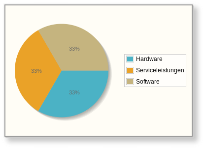
Selection of a Form Element
You can select only one ‘Form Element’ at a time. The selected element:
- is highlighted in the table with the currently used ‘Form elements’.
- has a symbol in the form view in the bottom right corner to increase/decrease the frame.
You can select a ‘Form Element‘ with
- a click on the corresponding entry in the table with the currently used ‘Form elements’
- a click on the appropriate element in the form view
Setting/Changing the Properties of a Form Element
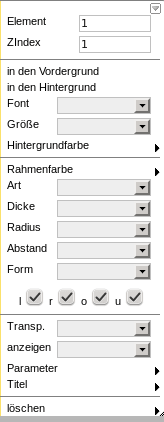
The prerequisite for setting / changing the properties of a form element is that it is selected.
- The Position in the form view can be changed by drag & drop or by entering the coordinates in the tool bar. The upper-left corner of the form is equivalent to X = 0, Y = 0 of. If it is an inner form element, x = 0, Y = 0 are the equivalent of the upper-left corner of the outer form element.
- To increase or decrease the size of a form element, drag the corner away from or toward the center or change the height and width by entering appropriate values (in pixel) in the toolbar.
When selecting the form element, a context menu opens, which allows the setting of additional properties. Hold down the CTRL key to select, move, or edit multiple items at the same time. In addition, a border can be drawn with the mouse button pressed, under which all elements are selected at once. In this case, the context menu reverts to the functions which can be executed simultaneously for several elements.
The following Menu Items/Displays are to be found in the Context Menu for all kinds of ‘Form Elements’:
- The Element Number is a unique identification (positive integer) for the ‘Form Element’. When you add a new ‘Form Element’, this non-modifiable ID is set by LIMBAS itself.
- The zIndex value
- determines, for overlapping ‘Form Elements’, which element is displayed in the front or in the back. An element with a higher zIndex value is in front of an element with a lower zIndex value. For identical values the selection of which element is shown in the front is random.
- is changed through the menu items front or back.
- determines the order in which input fields are selected when you use the form with the tab key.
- is set to the current highest value used in the form when selecting a ‘Form Element’ only when the global form setting ‘Z-index take into account’ is enabled. This allows you to quickly set up, the sequence in which the input fields of **is reassigned for all ‘Form elements’, with ‘Z-index replace’. So that there are no gaps in the zIndex values. The previous order is retained.
- With delete, the ‘Form Element’ will be deleted, without asking for confirmation.
The following Menu Items/Display/Settings are, depending on the type of the ‘Form element’, in the Context Menu:
- Copy, duplicates the ‘Form Element’ with all properties.
- Some ‘Form Elements’ can react to events ‘OnClick’, ‘OnDblClick’, ‘OnChange’, ‘OnMouseOver’ and ‘OnMouseOut’ with actions defined using JavaScript.
- For ‘Form Elements’ with text, set the font, the size, the display, the font color and the background color for the text.
- For ‘Form Element’ with a frame the border color, style , and thickness can be set, as well as which borders should be visible(left, right, bottom, top).
- For ‘Form Elements’, which display text or graphics inside the frame, form determines >whether the information is truncated (if there is not enough space in the frame)
>whether the information should be visible beyond the framework >whether a scrollbar is to be inserted ( fixed or automatically) >the minimum distance from the frame to the text - Border determines for a table, whether the frame of the table is displayed together or separately with the border of other table elements.
- For ‘Form Elements’, which display text or graphics inside the frame, form determines >whether the information is truncated (if there is not enough space in the frame)
- Is a CSS file is selected in the global settings of the form, an additional Menu Item Class appears in some ‘Form Elements’. When a CSS class is selected, the formatting of this class is used for the element, unless it is overwritten by another setting.
- For tables you can set the number of columns and rows.
- The ‘Tab Element’ can be extended via new tab with additional tabs.
- Some ‘Form Elements’, can by using Transp, allow other ‘Form Element’ in the background to be visible.
- The maximum allowable number of characters for ‘Form Elements’ used to enter text can be set by means of maxlen.
- Whether editing is permitted in the sub form, or not, can be set in View.
- Parameter (sub form)
- With the parameter it can be set whether, link tabs, menu bar, tool bar or footer are displayed or hidden for ‘Menu Bar Grouped’.
- Selection (only tables)
- Data content can be set to read only or read and write.
- If, for data content, the replace field is checked, and immediately after that a new data content ‘Form Element’ created that is associated with an element in the table, then original ‘Form Element’ will be deleted and the properties of the original will be assigned to the new element. This functionality can facilitate placing multiple data content ‘Form Element’ on the form together with the copy function. The check mark is automatically deleted after the following action.
Tabs
There are 2 ways to create tabs in a form.
Division & Main Menu Frame
The first and simplest option is to use the ‘Division’ field type in the table. Therefor a new field with the ‘Division’ type must be added in the relevant table. The form must have a ‘Main Frame’ element. Within the ‘Main Frame’ each ‘Division’ is represented as a tab with the name of the field. The first tab ‘all elements’ ensures that its sub elements are displayed in all tabs. To add elements, the tab must be selected. The selected tab will be highlighted with a red border. The added element is displayed relative to the tab frame. In the table field settings, a ‘JavaScript click event’ can be assigned to a ‘Division’ type table field. The script will be performed when using the tab. The option ‘ajaxpost’ ensures that the contents of the tab pane are loaded only when selected. This allows faster performance, as not all tabs will be selected all the time.
Tab Border
This form element allows you to define a free choice of tab areas. Tab borders can be nested. Tabs also can be arranged horizontally or vertically. Formatting options for ‘Form Element’ are available.
